



Tile Colour Psychology for Interior Spaces
Colour does quiet work in a room. Before anyone notices the furniture or the lighting, the floor and wall colour has already set the mood.
This is why tile colour psychology matters in interior design. The right tile colour makes a room feel calm, open, or warm, while the wrong one can make the same space feel cold or cramped.
This guide explains how tile colours affect the feel of interior spaces, and how to choose porcelain colours that match the job each room needs to do. It sits under our wider pillar on tile design ideas for modern homes and commercial spaces.
Why Tile Colour Shapes Mood
A floor covers the largest single surface in most rooms. Whatever colour it carries becomes the base note for everything else.
Light colours reflect more light, so they open up small rooms and make ceilings feel higher. Dark colours absorb light, which adds drama but can shrink a compact space.
Warm tones like beige and crema feel welcoming and soft. Cool tones like grey and silver feel clean, sharp, and formal.
How Common Tile Colours Affect a Space
Each colour family carries its own signal. Understanding these helps you match colour to purpose instead of guessing.
|
Colour family |
Feeling it creates |
Best rooms |
|---|---|---|
|
White / off-white |
Clean, open, spacious |
Small bathrooms, kitchens, compact flats |
|
Beige / crema |
Warm, calm, welcoming |
Living rooms, bedrooms |
|
Grey / silver |
Modern, formal, neutral |
Offices, lobbies, urban homes |
|
Black / dark onyx |
Bold, rich, dramatic |
Feature walls, foyers, hospitality |
|
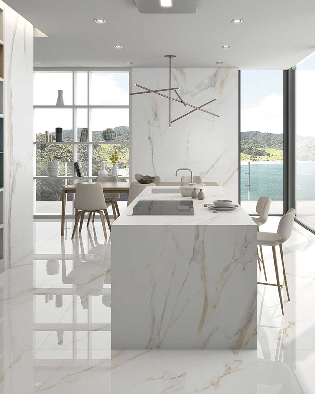
Marble-look neutrals |
Premium, timeless |
Living rooms, showrooms |
Notice that dark colours rarely suit full floors in small rooms. They work best as accents, not as the whole surface.
White and Off-White
White is the safe choice for compact and low-light rooms. It bounces light around and makes cramped spaces breathe.
The trade-off is upkeep, since lighter floors show dust sooner. Porcelain helps here because its low water absorption keeps stains from settling.
Beige and Crema
Beige is the most forgiving colour for Indian homes. It hides everyday dust better than white, and it pairs with almost any wood or fabric.
For living rooms and bedrooms where you want warmth, beige and crema marble looks are hard to beat.
Grey and Silver
Grey has become the signature colour of modern interiors. It reads as clean and current without being cold, especially in warmer grey shades.
Offices and city apartments lean on grey because it stays neutral against changing decor. Large neutral floors in grey also suit big commercial jobs, which is why Rollence supplies these formats as a 1200x1200 porcelain tiles supplier in egypt for open retail and office projects.
Dark and Onyx Tones
Dark tiles carry weight and mood. Used well, an Onyx feature wall turns an ordinary room into something memorable.
Used wrong, a full dark floor can make a small room feel like a box. Keep dark colours for accent surfaces and let lighter tones carry the main floor.
Matching Colour to Room Function
Every room has a job, and colour should support it. A bedroom needs rest, a kitchen needs energy and cleanliness, an office needs focus.
-
Bedrooms suit warm, soft neutrals that help you wind down.
-
Kitchens suit clean, bright colours that feel hygienic.
-
Living rooms suit calm neutrals with one accent for character.
-
Bathrooms suit light colours that feel fresh, with darker accents in moderation.
-
Offices suit cool greys that support concentration.
When you plan colour by function first, the whole home feels intentional rather than random.
Warm Versus Cool: Getting the Balance Right
Most homes feel best with a lead temperature and small contrast. An all-warm home can feel heavy, while an all-cool home can feel clinical.
A common trick is a warm beige floor with a cooler grey feature, or a cool grey floor with a warm wood-look accent. This small contrast keeps a space from feeling flat.
For living room colour pairings that use this idea, our guide on best tile colour combinations for living rooms gives ready combinations to copy.
Colour, Light, and Room Size
Natural light changes how a colour reads. The same grey tile looks bright in a sunny north-facing room and dull in a dark corner.
Always check a full tile in the actual room light before you decide. A colour that looks perfect in a bright showroom can turn heavy in a shaded flat.
For small rooms, stay light. For large rooms with good light, you have freedom to go darker and richer.
Bringing Colours Together on a Project
Choosing one good colour is easy. Making five rooms of colour work together is the hard part.
Designers group compatible colours and finishes before ordering, so the home flows from room to room. Our piece on how designers use Rollence concept boards for projects shows how this planning avoids clashes.
Rollence organises its porcelain into clear series such as Beige/Crema, Grey/Silver, Onyx, and Statuario, which makes it simpler to pick a colour family and stay consistent.
Common Colour Mistakes
A few colour errors show up on almost every unplanned project.
-
Choosing a floor colour that fights the wall paint, so the room feels off.
-
Going too dark in a small, low-light room.
-
Using five different colours across connected rooms, which breaks the flow.
-
Picking colour under showroom lighting only, then feeling surprised on site.
Choosing Colour With Confidence
Tile colour is not just about taste. It is about matching a colour to the mood and function a room needs, then checking it in real light before you commit.
Rollence Granito produces porcelain across warm, cool, and neutral colour families, all in large formats. Explore the series on the Rollence website and request samples to test colours in your own space.
Frequently Asked Questions
Which tile colour makes a room look bigger?
Light colours such as white, off-white, and light beige reflect more light and make rooms feel larger and more open.
Are grey tiles going out of style?
Grey remains a strong, neutral choice for modern interiors. Warmer grey shades feel current and pair well with wood and soft furnishings.
What tile colour is best for a small bathroom?
Light colours like white and light beige work best in small bathrooms, as they open up the space and keep it feeling fresh.
Can I mix warm and cool tile colours?
Yes. A lead colour with a small contrast, such as a warm beige floor with a grey accent, keeps a space balanced and interesting.
Do dark tiles suit Indian homes?
Dark tiles suit feature walls, foyers, and hospitality settings. For full floors in average-size rooms, lighter colours are usually the safer choice.
Which colour hides dust best?
Beige and mid-tone neutrals hide everyday dust better than pure white or very dark colours, which makes them practical for busy homes.

